"Pay attention to the world." -- Susan Sontag
 

Winter Color at January’s End (1 of 2)

From “Nature” in The Selected Writings of Ralph Waldo Emerson by Ralph Waldo Emerson:

“The inhabitants of cities suppose that the country landscape is pleasant only half the year. I please myself with the graces of the winter scenery, and believe that we are as much touched by it as by the genial influences of summer….

“To the attentive eye, each moment of the year has its own beauty, and in the same field, it beholds, every hour, a picture which was never seen before and which shall never be seen again. The heavens change every moment, and reflect their glory or gloom on the plains beneath.”

From “Wild Peaches” by Elinor Wylie in Three Centuries of American Poetry edited by Allen Mandelbaum and Robert D. Richardson:

“The spring begins before the winter’s over.”


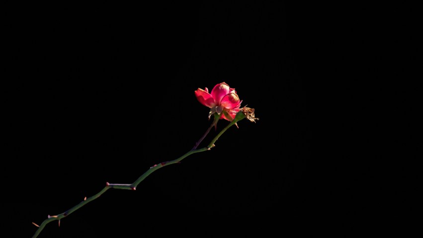
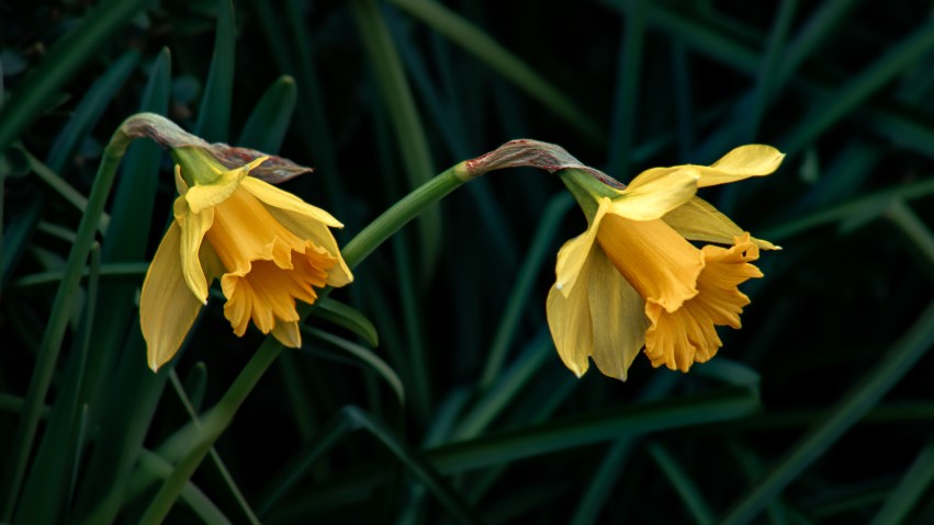
As we approach the end of January, I’ve posted a few photos taken during the unseasonably warm first half of the month (the unseasonable warmness didn’t last), where I found surprising bits of color among the more muted tones of winter.

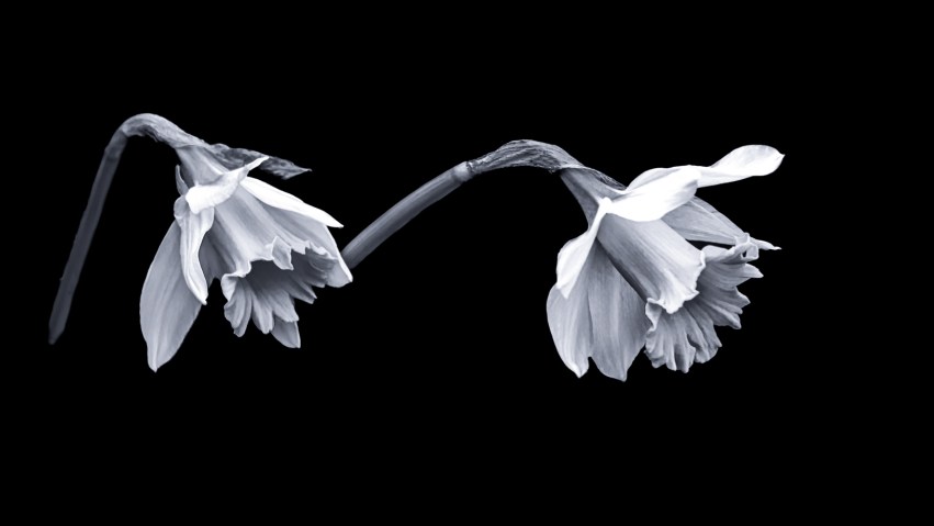
The mahonia (in the second gallery below) was a striking mix of winter and spring, with yellow flower clusters growing among green leaves, surrounded by other leaves that apparently felt the cold more and had turned deep purple. I also found a rare pair of yellow daffodils, looking a little tentative but nevertheless quite adorable in their willingness to sneak out of the ground this time of year. And the two roses — southern roses are pretty resilient — seemed unaware that a cold snap was on the way, even though their stems were mottled and faded as they tend to get when the nights are cool. I guess they might have been thinking that winter was just an illusion….

Thanks for taking a look!


Winter Wisps (and a Bird at Liftoff)

From “The Journal of Henry David Thoreau” in The Complete Works of Henry David Thoreau by Henry David Thoreau:

“[Dec. 26, 1855] After snow, rain, and hail yesterday and last night, we have this morning quite a glaze, there being at last an inch or two of crusted snow on the ground, the most we have had. The sun comes out at 9 A. M. and lights up the ice-incrusted trees, but it is pretty warm and the ice rapidly melts. I go to Walden via the almshouse and up the railroad….

“Trees seen in the west against the dark cloud, the sun shining on them, are perfectly white as frostwork, and their outlines very perfectly and distinctly revealed, great wisps that they are and ghosts of trees, with recurved twigs….”

From The Selected Writings of Ralph Waldo Emerson by Ralph Waldo Emerson:

“[The] Will-of-the-wisp vanishes if you go too near, vanishes if you go too far, and only blazes at one angle.”


Continuing with some additional studies of winter shapes (see also Winter Shapes: Hydrangeas and Japanese Maple Leaves and Winter Shapes: Hydrangeas and Japanese Maple Leaves in Black and White), here is a random collection of tiny leaves, stems, and vines — followed by a set of five images of goldenrod rendered on black, followed at the end by lucky shots of resting bird that spread its wings and took off just as I pressed the camera’s shutter.

Thanks for taking a look!


Winter Shapes: Hydrangeas and Japanese Maple Leaves in Black and White

From “Structure” and “Tonal Nuance” in Black & White Photography by Michael Freeman:

“Image possibilities that contain a strong potential for structure notably include elements of line and shape, almost always heightened by some form of contrast….

“Black and white enhances these possibilities by taking away the distraction of colour, forcing more attention on the contrast across edges….

“Physiologically, our visual system responds more sensitively to some hues than to others, which is why yellows and yellow-greens are brighter to our eyes. But more than this, there is our psychological response to different hues. One simple example of this is that ‘hot’ colours around orange are readily associated with flame and burning, and also the production of light. Most people feel these to be inherently brighter than, say, blues, which we tend to associate with water, coolness, and dim light.

“Take this away, and the tonal scale simplifies dramatically. What this allows is a clearer, purer concentration on the subtleties of transition between shades of gray.”


Hello! A few days ago I posted a some photos of hibernating hydrangea and Japanese maple leaves; here are the same photos, rendered in black and white, and modified with various filters in the Nik Collection to create additional contrast and detail, add a bit of glowing softness, and shift the black-and-white tones to a touch of silver-blue.

At the end of this post, there is a before-and-after gallery, if you would like to compare the color and black-and-white versions.

Thanks for taking a look!


Here are the before-and-after images; select the first one to compare versions in a slideshow.


Winter Shapes: Hydrangeas and Japanese Maple Leaves

From Expressive Nature Photography: Design, Composition, and Color in Outdoor Imagery by Brenda Tharp:

“It takes practice to get the look you want, and each situation is unique in what it presents in terms of light, color, and pattern. The best way to determine a reference point for this type of picture is simply to experiment and see what you get.”

From Light on the Landscape: Photographs and Lessons from a Life in Photography by William Neill:

“When trees are bare, their graceful forms are starkly revealed. The tones of beige and gray or black and white form a subtle palette in the landscape. The lines of grass and shrub, ice and fallen leaves, display themselves in simple, elegant designs, like a drawing or etching…. Winter photography offers us options at all scales.”


Hello!

I liked the first quotation above because it accurately expressed what I was trying to do with the photographs in the galleries below. Winter color in my part of the southeastern United States is often an odd mix of monochrome interspersed with bright whites, pale yellows, and greens from those hardy plants that don’t mind temperatures in the forty-to-fifty degree range; so some days I go hunting for washed-out colors and other days I look out for hidden bits of bright color instead. These photos are from a mostly-monochrome day.

The first five photos show the remnants of Japanese Maple leaves still clinging to their branches; and the six that follow are desiccated hydrangea leaves and flowers — all with some color and luminance adjustments (among other things) and with their backgrounds “painted” black.

Given the fine details within each of these photos, Lightroom stumbled a little at automatic subject selection; and I ended out spending quite a few hours carefully mousing around the edges of these leaves and branches to get the look I wanted. In the end, there were only a few photos in this set that I was satisfied with, but decided to post them anyway since that’s what experiments are all about: seeing (and in this case, sharing) what you get. I may take a shot at converting some of these to black and white; they might look good that way, and help reduce what (to me, at least) appear to be flaws in these renderings.

The last gallery, at the end of this post, shows the before-and-after versions of each of the five maple leaf photos and six hydrangea photos.

Thanks for taking a look!


Here are the before-and-after images; there were a lot of details to paint! 🙂


Paperwhites, Quince, and Camellia in Black and White

From Expressive Nature Photography: Design, Composition, and Color in Outdoor Imagery by Brenda Tharp:

“Until color film became reliable, many great photographers brought to light the beauty they saw in nature using black-and-white imagery. Some of them stayed with black and white their entire lives. While Ansel Adams used color in his early commercial work, he chose black and white to express the natural world that he loved. Black-and-white work has long been considered to be art photography.

“Working in black and white will actually strengthen your ability to compose pictures, and to see and use light. In the absence of color, we can see the shapes, lines, forms, and textures that light reveals in the landscape. Color can seduce us away from those things, if we let it. I maintain that you can work in both color and black and white and do well, if you are looking at the elements for their graphic representation and paying attention to tonal values. I still think in color, and I understand the language of color, after so many more years devoted to it…. But the digital darkroom has allowed me to explore black and white more easily again, and now, when I create a black-and-white image, it’s because the color isn’t doing it for me, while light and contrast are.”


“It was a dark and stormy day….”

Actually it wasn’t that stormy until a few minutes ago, but it has been unusually dark — dark gray winter dark — all day long, so despite my camera begging me to take it on an outing, I opted to stay in, keep it dry, and convert a few of my previously posted photos to black and white.

I probably don’t do these conversions often enough, especially since I do find the exercise interesting — more interesting than just pushing the “Black & White” button in Lightroom. The button-push creates a very literal interpretation of the image with the color replaced by gray tones that look pretty flat and lack contrast. The fun comes when you realize that in the color photos the white blossoms aren’t just white but contain blue, aqua, and sometimes yellow or orange; the stems contain green, red, yellow, orange, and a bit of purple; and the backgrounds (for those where I hadn’t already removed it) contain every color Lightroom lets you work with: red, orange, yellow, green, aqua, blue, purple, and magenta.

Playing with the “Black and White Mix” in Lightroom lets you adjust various color channels to bring in more contrast; in this case, I could brighten up the flower petals, dim the backgrounds and stems, and create little black dots or other shapes in the center of those blooms that had yellow or orange filaments in the color photos. After doing that with these photos, I then used Lightroom’s Color Grading to add a little silver/blue to the midtones, shadows, and highlights — which is just something I like (and previously described here, here, and here). For these photos — especially the camellia’s, the last two images — I added more softening than I usually do using Lightroom’s Texture and Clarity adjustments, because they seemed to work well on those big white petals.

As I was working on these, I started wondering if I would have composed any of the images differently if I intended them to be black-and-white images instead of color. I already know that I often compose with the idea of removing backgrounds in mind, so it would seem that I might do something different on a shoot if I was intentionally trying to produce grayscale images. Like many people, I suppose, I shoot in color because Lightroom lets you convert color to black-and-white, but not black-and-white to color. Theoretically, the camera captures more shadow and contrast variations by shooting in color then converting; but I’ve never tried it so I think it might be worth switching the camera to black-and-white mode to see what happens. Also, creatively speaking, sometimes it’s good to work within an artificial constraint like this just to learn from it.

Below are the black-and-white images, paperwhites followed by quince then two camellia blossoms. After that, I’ve included a single gallery showing the color and black-and-white versions for comparison.

Thanks for taking a look!