

Hello! Below is the second of two galleries featuring clematis blooms from my garden. The first gallery included photos of a Bernadine Clematis; this gallery shows a President Clematis — previously posted as buds and vines on a chair, here.
I learned something new while processing the photos for this gallery, as they came out of the camera looking like this:

I loaded about fifty images of the flower into Lightroom and deleted those that were out of focus, then started making adjustments to get better contrast and color out of this over-saturated blue. I’ve owned several Sony digital cameras and have often found that, regardless of white balance settings, the cameras render cooler-than-actual colors — which usually show up in the photos as bluish cast that’s easily stripped out using Lightroom or other tools, and often doesn’t need to be adjusted at all. Still… this blue seemed over-the-top and as I was working on the fourth or fifth photo, a question popped: is the President Clematis blue? I was already indoors of course so I did a search for President Clematis images… only to find a mix of blue, purple, and violet flower pictures along with a few of unrecognizable color. So I did what I should have done in the first place: I went outside and looked at the actual flowers.
Imagine my surprise: the flower is definitely not blue, but a mix of purple, violet, and blue, with colors in the purple and violet ranges most dominant on the petals and blue gradients (on the larger flowers) toward the edges. Funny that I didn’t know that without physically looking, but apparently color memory is not that reliable.
So… a fine side-effect to manually choosing exposure characteristics and white balance (instead of using the camera’s automatic settings) is that you know what you did, and, more or less, why you did it. Outdoor light changes constantly and with macro lenses the changes can have a significant effect; but it’s also true that the photos in both galleries were taken on the same day, at around the same time, with about the same lighting, and with similar camera settings. I didn’t have any problems with the Bernadine Clematis colors, only those on the President Clematis.
Some folks reading this may already know the punch line, but I didn’t. I kept the photos I had already taken, and went back outside to figure out what had happened. It was a little disconcerting: my right eye, looking through the camera’s viewfinder, saw blue; my left eye, peeking around the camera, saw purple. I was pretty sure my eyes weren’t broken, so I started changing camera settings and found that the only way I could get the camera to render the flowers as purple was to manually set an extremely warm white balance — getting an almost exact match for the purple in the flowers, but also casting yellow over everything else in the photo. Corrections in Lightroom didn’t fix that: adjusting white balance there to try to compensate simply slid the flowers back from violet and purple to blue. What a hoot!
As it turns out, digital cameras can be color-challenged when reproducing colors in the purple-to-violet range, and the color shifts even more toward blue as the intensity of violet color increases. See, for example, Why are My Purple Flowers Blue? — which shows an image with a nearly identical color misinterpretation as mine. After trying numerous color adjustments, I learned from The Color Purple and the Digital Camera to start by adjusting the blue hue first…
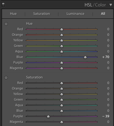
… and decreasing purple saturation since the color was so intense. These adjustments got me closer to the original color as my eyes saw it, and I could then keep the flower color in check while making additional exposure and color adjustments so that the background elements still looked right. The President Clematis blooms don’t last very long; all of the blooms in these pictures have since blown away so I was glad to have gotten it sorted. I still think a few of the photos in this set ended out with some slightly unnatural colors; but let’s just say that was a creative choice. 🙂
Select the first image to begin a slideshow; thanks for reading and taking a look!


Oh, and another surprise. I usually only get a handful of blooms from this plant, all at about the same time in mid- to late-April… but this year it looks like there may be more!

Lovely images! And thanks for the link to my purple prose! lol
You’re welcomed! And thank you! I spent hours trying to get these right, and almost gave up, then I found your tip about adjusting the blue hue … so it’s fair to say these images wouldn’t have made it here without your help! 🙂 🙂 🙂
Stunning in their delicacy. I had a similar challenge with a hummingbird on my recent “Yardbirds” post. When shooting (always RAW, where white balance is handled in post) I watch the RGB histogram and expose so as not to blow out the predominant channel. Red, for me, in those hummingbird shots. Probably blue and red in these. Makes RAW processing and other post processing much easier.
Thank you! Both the blue and red show up strongly in the RAW files’ histograms; but the blue dominates for sure and the red is mostly at the center of each flower. I do hope to get another crack at a couple more of these; even though I have flowers of similar color in the garden, there’s nothing quite as intense purple/violet as these Clematis blooms and they clearly have more lessons to teach me! Thanks for the comment…. 🙂
This was a really interesting read. I absolutely love the very last bloom shot and here’s hoping that you get the bonus blooms.
Thank you! I liked that shot also! 🙂
I check on the new buds every day and they keep getting bigger … in about a week, maybe, I’ll get my bonus! 🙂 🙂 🙂
I’ll expect a post about that 🙂