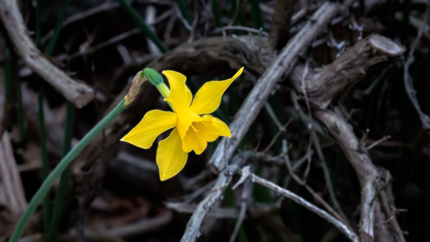
"Pay attention to the world." -- Susan Sontag
 

Lily of the Nile (Baby Pete): Gallery 1 of 2

Several times each week during the month of May, I took a series of photos of a lily that I added to my garden in April, as a way of chronicling its growth. It’s a variation of Lily of the Nile, a hardy plant that builds clusters of blooms on tall green stems, and so far has produced about a dozen such clusters since I got it. I don’t know why it’s called “Baby Pete” — but I assume someone somewhere had a good reason for that.

According to Wikipedia, a Lily of the Nile may live 75 years. Which means! When I’m in my 120s, I’ll still be taking pictures of this plant — by then most likely with my eyeball camera and macro contact lens, followed by post-processing with Adobe Lightroom sensors embedded in my fingers, then direct uploading from my networked brain stem. Good times!

No special notes to provide about how I processed these photos. I made use of radial filters as I described in Before and After: Yellow and Green (and Lightroom Radial Filters) then passed each one through Nik Collection’s Color Efex Pro, mostly to remove color cast and improve contrast. This first gallery shows the plant up to the point where the flowers were just starting to stretch open; in the next gallery, I’ll show the clusters in bloom.

I’m working on the companion piece to Before and After: Yellow and Green (and Lightroom Radial Filters) where I’ll write about how I used Lightroom’s mysterious Tone Curve panel, and add my contribution to the general confusion on the web about what this function actually does. I’m also working on 134 photos of the four kinds of Lantana in my garden, the images that I kept after culling about six hundred that I took of those plants.

134 photos! Argh! This may take some time….

Thanks for reading and taking a look!

Before and After: Yellow and Green (and Lightroom Radial Filters)

The more I learn about using post-processing software like Adobe Lightroom, the more I find new potential in my photos. A few weeks ago, on a Wordless Wednesday, I posted two galleries: one of isolated hydrangea leaves with emphasized color and detail, and one containing photos of spotted dead nettle where I shifted the white highlights on the leaves to shiny silver. Those two galleries were fun to do; but equally important, I learned new skills while doing them. This is the first of two “Before and After” posts where I’ll describe what I did to create the images for those two galleries, from studying the original photos to making decisions about possible enhancements through to the adjustments I applied using Lightroom.

There’s always a temporary downside to adding new tools to a creative process, and as I’ve been experimenting with Lightroom on these and many other (not yet posted) images, I’m running into that downside: I’m spending a lot more time on individual photos and I get a little stuck with each one trying to decide what to do. Making these decisions feels a bit like confusion or cognitive dissonance with at least a dash of frustration, which I try to reduce by remembering something I heard from creativity teacher Julia Cameron many years ago. Learning and growth don’t move forward smoothly, she maintained; instead, as she described it, they move along at a certain steady pace, then seem to fall apart as you experiment, then re-integrate in your mind at a more comprehensive and useful level. She addresses this subject in many of her books, of course, but I found it most explicitly in her taped lecture called Reflections on the Artist’s Way, where she said:

“When you teach creative writing, people write along at a certain level, then everything falls apart. Well, thatโ€™s the way growth works. You go along like this, then it all falls apart, [then] it re-integrates at a different level. And when weโ€™re talking about [creativity], you have to understand that youโ€™re going to go along like this, then itโ€™s going to be a mess, then itโ€™s going to integrate….”

I’ve always thought of this as the “Everything Falls Apart” metaphor, one that applies not only to creative writing but to photography and equally to any other type of creative endeavor. To remember that everything will fall apart doesn’t necessarily eliminate the mental tension someone might feel when trying to learn something new, but it does help as a reminder to expect some level of disconnectedness as you expand your skills and make changes to your creative methods — and as a reminder that that stress is temporary. Like learning any new skill, the sense that you are “out of sorts” — the “I just can’t do this” feeling — will pass. And knowing that it will pass can help you push through it to the point where the new skills are incorporated into your thinking and become a more automatic part of your thought processes and workflows.

When I look at a group of related photos I want to work on, there’s almost always one that gets me thinking about what approach I’ll take during post-processing, even though the possible variations are endless and the starting point is often arbitrary. From the set of five hydrangea leaf images, here is the original photo that got me started:

I liked the leaf in the foreground and the one in the shadows behind it; together they created some compositional balance. I also liked the textures and color contrasts: hydrangea leaves typically grow to their final full size here in mid- to late-June, and at that point show intense colors and textures as they thicken and widen. Yet the left quarter of the photo with the blurry intrusion of other leaves and a white smudge made the image unusable as taken: to crop that out (at the photo’s original proportions) would have also cut out most of the foreground leaf. Cropping can be a great post-processing friend, except when it isn’t.

I first applied some vignetting to darken all the edges with a few clicks, then removed it because it’s not very subtle and created too much of a black frame around all four sides of the image. While backgrounds can establish context for the image’s main subject, vignetting removed most of that context and wasn’t right for what I imagined as the end result. Similarly — because the image is heavily shadowed — global exposure adjustments to contrasts, whites, shadows, and blacks simply rendered the whole scene too much darker than the original with no real presence for the subject.

So instead I thought I would experiment with a few things I’d recently learned about using radial filters from some of the B&H EventSpace presentations I wrote about previously. There are three types of similar filters in Lightroom: graduated filters (to select a linear or horizontal area to modify); radial filters (to select a circular or an oval area to modify); and adjustment brushes (which let you patiently select an area to modify by brushing or painting over it). Each of these techniques enables targeted adjustments using many of the settings available for an entire photo, including all of these:

The “Feather” slider toward the bottom of the panel determines how much the selection mask blends with the surrounding image elements; and the “Invert” toggle flips the effect from the area you select initially to apply it to the surrounding area instead.

The Texture slider — near the middle of this panel — is a new Lightroom function, added earlier this year. It enhances fine detail without (unlike Clarity) altering color, luminance, or saturation or creating raggedy edges (like Sharpening sometimes does). In last week’s Wordless Wednesday — Wordless Wednesday: Red, White, and Shades of Blue — I was able to significantly increase detail (perceived as focus) in each of the blooms by combining three adjustments: decreasing Highlights at least by half, using Dehaze to improve contrast inside the petals, and then using Texture to enhance the shapes of each of the flowers.

It may seem complicated, but it really isn’t — especially if you think of it in terms of how you want to change a photo. With the hydrangea leaf image I included above, I knew I wanted to: eliminate the out-of-focus and smudged elements on the left; eliminate the small leaf intruding from the bottom right; and emphasize the color and detail present in the leaf facing front. Some initial Tone and Presence adjustments…

… got me partway there …

… but I couldn’t reduce shadows any more at this point, and further changes to other global settings darkened the subject more than I wanted. To darken the background further, I clicked to create a radial filter in the center of the leaf, inverted it, mouse-dragged a circle to define the area I wanted to adjust, then reduced the exposure for that area (so the leaves remained mostly unchanged).

The red shading shows the area that will be affected — the mask — and can be turned on or off or set to a different color from the Tools menu. The level of feathering, described earlier, determines to what extent the mask softens as it approaches the area that will not be affected by my adjustments.

Radial filters can be duplicated (by right-clicking at the pin in the center) to stack multiple filters on top of each other, which sometimes yields interesting results as the duplication doubles the effect of the adjustments. In this case, however, I wanted to switch from working on the background to working on the leaf, so I duplicated then inverted it to simplify selecting the leaf for adjustment. I then used Dehaze, Saturation, and Texture increases to bring out the color and detail in the leaf, so that the green and yellow contrasts (as well as the increased focus) draw the eye toward this as the subject.

After duplicating and inverting the radial filter I used for the background, I slid the new one to the left slightly so it would be easier to switch from the foreground filter to the background filter. Lightroom automatically defined the area the new filter would cover when I duplicated it, though I could still adjust it by mouse-grabbing the edges of the filter.

With these adjustments complete, the final image reflects my original vision for improving it: the foreground leaf shows decent color contrast and detail, and the leaf in the shadows provides balance to the composition.

The remaining photos in this series all got very similar changes, nearly identical in the areas I was defining as the main subject. Background adjustments varied in terms of whites, blacks, and shadows — really just by sliding the sliders around until I got a look I liked.

Here are the before and after versions of each of the five images; select the first one if you would like to see them in a slideshow.

Thanks for looking … and reading!

Special Effects Coleus: Another Gallery

On Wordless Wednesday this week, I posted nine photos of three identical coleus plants I added to my garden this year, and the gallery below contains eleven additional images.

Coleus — typically a fast growing annual — is always notable for intense colors throughout its leaves and stems, making it a great subject for close-up photography. This variety’s name is “Special Effects” — that isn’t something I did to enhance the photos — because of the luminous whites, yellows, and reds throughout its leaves. The leaf in the fourth photo below, for example, appears to have added light; but that’s actually how it looks, even in the shade.

Select any image to begin a slideshow; thanks for taking a look!