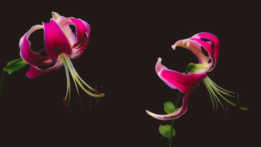
"Pay attention to the world." -- Susan Sontag
 

Before and After: Flickr Reboot – Orchids

For my Flickr Reboot project, I decided to start by working on photos I’d taken of orchids at the Atlanta Botanical Garden, thinking that the variety of colors, focal lengths, and scenes in these photos would help me explore the capabilities in Lightroom as well as the tools and filters available in the Nik Collection by DxO.

I first cropped and straightened the images in Lightroom, then removed any distracting spots as well as any artifacts created by dust on the camera sensor or lens. If I thought the image would be improved by darkening or softening its background elements, I used graduated or radial filters to make those alterations by decreasing exposure, clarity, and sharpness. For some of the images, I increased saturation on or shifted some of the colors (usually those in the blue, purple, and magenta ranges) just a bit, since I knew I might apply additional color, saturation, or contrast adjustments using the Nik Collection filters. Given that the focus and light characteristics of all the images was similar, I typically applied the same amount of sharpening and noise reduction to each one before moving on to continue processing with the Nik Collection.

The Collection includes a tool called DFine 2 that I used on each photo to further reduce noise, which the tool accomplishes by taking a few seconds to analyze the image and apply an automatic noise reduction. To this point in the workflow, everything was pretty straightforward and once the noise reduction was applied, I had a good idea whether to keep working on an image or move on to a different one. With several hundred to choose from, it seemed smart to be strict about culling those I thought might yield unsatisfactory results. Obviously, the rejects aren’t included in this blog post … 🙂 … although it might be fun to bring up a few examples of the “fails” and write about those too.

I spent most of my time adjusting the images using the filters in Color Efex Pro. It was a little intimidating at first to determine which ones would be most useful, since some of the filters are more aligned with technical improvements and others introduce creative effects. All of this is very subjective, of course, especially when there are so many choices and you can readily convert any photo to something completely different by selecting different filters. But since my goal was to improve the photos rather than significantly change their appearance — and after processing some and starting over several times — I ended out using certain filters frequently and in a similar sequence, like this:

White Neutralizer: This filter removed color cast from the photos, brightening and clarifying the whites and altering some color characteristics. Though I used it on every one, its effects are very evident on the first four, where white in the blooms is much more like “pure white” in the after-image. The filter also shifted purple to light blue, and the extent of that color change was easily adjusted with the filter’s settings.

Brilliance/Warmth: I used this filter to adjust color saturation and emphasize contrasts between colors, mostly to the foreground elements of individual images.

Darken/Lighten Center: This filter was a lot of fun. Its settings allowed me to brighten specific areas in the images while simultaneously darkening other areas. The filter lets you set your own image center with a point-and-click and define the size of the area to be brightened, so you can stab at an area of the image then decide how broadly you want to apply the effect. This one is most evident in the second to last photo, where I wanted to re-balance the lighting over the cluster of orchid blooms.

Tonal Contrast: While this wasn’t necessarily the only filter I used to alter contrast, I found that it did a good job of enhancing the distinction between foreground and background elements. Very evident in the last photo (though applicable to all), the effect of the filter was to increase the appearance of depth by further darkening and softening backgrounds beyond Lightroom graduated filters, giving the foreground elements more color, clarity, and presence.

As a last step, I ran all of the images through Nik’s Output Sharpener, mainly to apply sharpening, structural detail, or additional focus to specific parts of each image rather than the whole. I learned pretty quickly that I had to be careful about applying too much sharpening with this tool, and that it was most appropriate (since I had already globally sharpened the image in Lightroom) for selective sharpening.

I’ve added a “Nik Collection” category to this site; my previous posts exploring the software are here.

Over the weekend, I’ll be attending two webinars presented by DxO Labs: one providing an overview of all the tools in the Collection, and one about advanced features. I will take notes!

Select the first image below to slideshow through the before and after versions; thanks for reading and taking a look!

Secrets Inside a Grapevine

Earlier this week, on a hot and sunny morning, I wanted to find out what I would see if I stuck my head and my macro lens into the interior of a Catawba Grapevine, behind the broad leaves and long stems twisted throughout an old iron obelisk trellis in one corner of my garden. The Catawba Grapevine is one of two I planted years ago as an experiment; the other is a Concord Grapevine, growing in a four-foot tall ceramic pot, winding up and through the bars of a fan-shaped trellis. Neither one produces grapes any more, but the Catawba has been returning every year for four years, and the Concord has grown back each spring and summer for eight years. In their first couple of years they both produced grapes, though the grapes never matured beyond the size of a pea: birds loved the tiny grapes and it was common for me to see a flurry of wings and beaks jabbing at the grape clusters until they were picked clean.

Both vines continue to grow and develop new leaves, stems, and tendrils until cooler fall weather sets in, when the leaves turn pale yellow, light orange, then brown as they begin to fall off. I looked for some of the tinier subjects to photograph; the photos below show some of the emerging leaves and the lines and curves of the tendrils as they search for places to attach. Sunlight, while very bright when I took these pictures, was filtered through the leaves, caused some harshness and clipping that I adjusted out of the photos as much as possible. At the same time, the sunlight also created some interesting background shapes and colors. Where you see a lot of white in the new leaves, that’s because they’re white on the bottom and shades of green and yellow on the top side.

The tendrils were a challenge to photograph, as the slightest breeze pushed them out of focus, and I’ll likely make another attempt at similar shots on a calmer day. The white clipping on the last photo was driving me crazy: I kept trying to de-emphasize it but couldn’t get it right without creating distracting artifacts in the image. I ended out emphasizing it instead by blurring and darkening the background, so it looks like a little flame instead of a … flameout.

These tendrils seem delicate but in reality are quite strong. The Catawba attaches itself tightly to the iron bars, and frequently latches onto the branches of Chinese fringe flower bushes that are growing nearby. I always thought it was just wind, coincidence, and a bit of stickiness that prompted the tendrils to attach to something, but I learned while researching this article that the plant follows a chemical and physiological process called thigmotropism to seek out and hook to attachment points. The tendrils can discriminate between the plant itself and other attachment points, favoring external attachments over self-attachment. This process can occur quickly: according to The Secret Life of Plants by Peter Tompkins and Christopher Bird:

“When the tendril … finds a perch, within twenty seconds it starts to curve around the object, and within the hour has wound itself so firmly it is hard to tear away. The tendril then curls itself like a corkscrew and in so doing raises the vine to itself.”

There is a description of this process, and some of the research behind it, at The Guardian, here: Scientists unwind the secrets of climbing plants’ tendrils; and an illustrated guide to the parts of a grapevine here: Grapevine Structure and Function (pdf).

Select any of the images below to begin a slideshow. As always: thanks for reading and taking a look!

Lantana Bonanza! The Sequel

This is true: I often buy plants for my garden based on how I think they’ll look in photographs.

When I saw these Landmark Citrus Lantana at a nearby garden center and knew I had a couple of open medium-sized pots on my back-yard steps, I snapped them up and gave them a good home. I figured their flowers would start opening within a few days – given that the steps get plenty of sunlight during the day – and they didn’t disappoint. The overall shape of the flower is very similar to the Chapel Hill Yellow Lantana, of course, but in addition to variations of yellow and orange colors, these flowers also show purple and magenta in the emerging and center buds, surrounded by yellow and orange petals as the flowers open.

I followed a similar process for selecting images for this post, choosing these sixteen from about 80 that I took and reviewed for adequate exposure and focus. On most of the photos, I used several Lightroom graduated filters – tools that are now among my favorites to apply during closeup and macro work. In those photos showing a single flower bud, for example, I created separate graduated filters from all four sides of the photo through to the center, adjusting exposure and reducing clarity on each of the four filters to dim and soften the background.

I then emphasized the flowers as focal points by increasing overall exposure slightly, adding a touch of light, and increasing saturation and luminance for purple, magenta, and orange to pop those colors. For some of the photos that show wide-open buds in bright yellow, I dropped yellow saturation a bit, as the yellow caught a lot of light and looked a little harsh and over-exposed with raggedy edges. The light was pretty good when I took these shots – which helped with depth-of-field and focus – but I did apply additional sharpening to give some of the flowers a bit of extra punch. As a final step before exporting the images from Lightroom, I removed a few spots where pollen on the leaves caught a sharp jab of sunlight, though there wasn’t much of that kind of spot removal to do since recent rains left the leaves sparkly clean.

Before uploading the images, I always rename them with sequence numbers at the beginning of the names (like 01-DSC04636.jpg, 02-DSC04549.jpg, etc.) so that they’re names represent the order I want them to appear in the blog post or slideshow. That way I can preview the slideshow before uploading – using Adobe Bridge or another photo viewer – simply by having the viewer display the images in file name order. This always saves me some time when creating a media gallery for the blog post, since I’ve already decided on a sequence for the slideshow images and I can easily add the images to the gallery by file name.

This slideshow is loosely arranged by similarity, and you can select any of the photos below to begin viewing larger versions. My previous lantana slideshow is here: Lantana Bonanza!

Thanks for taking a look!