From “Nature vs. Nurture” in One Man’s Garden by Henry Mitchell:
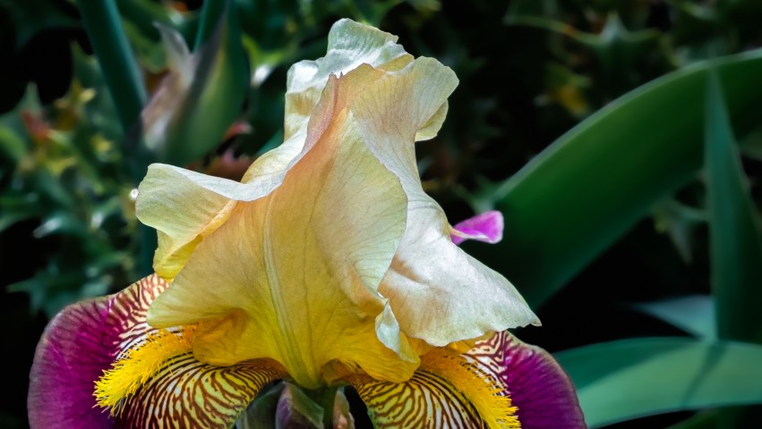
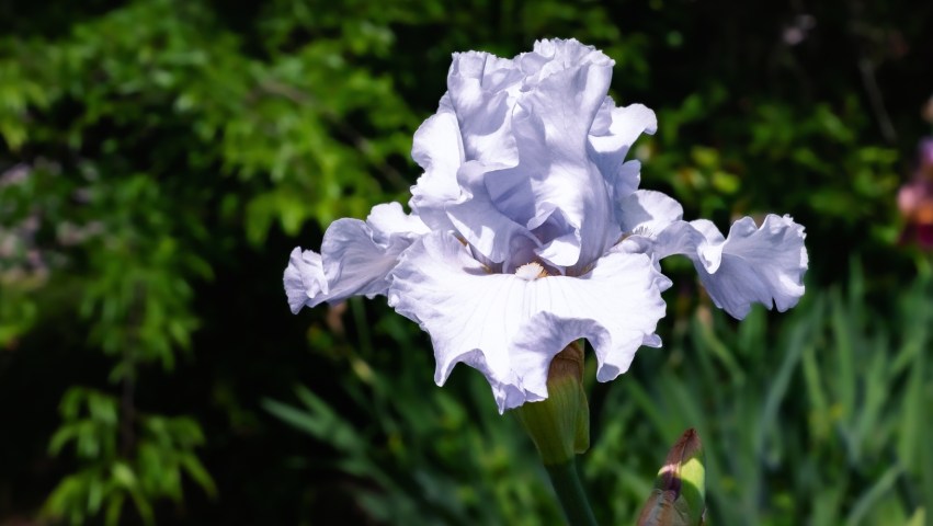
“Often I surprise myself at how little I notice in a flower, and the reason for this is haste and excitement with the flower as a whole. The beauty of an iris, say, is so great that it was years before I paid much attention to its structure. Eventually, when I bred irises in a small way, I marveled at the elegance of the style arms, the stigmatic lip, the wonderful tight way in which the stamens curve to fit the curvature of the arm.
“The casual viewer, who may admire the beauty of the iris as much as any fanatic iris fancier, will wonder how the dedicated gardener can tell the name of every iris among, say, five hundred kinds in the garden. But it is easy if you know and love the flowers.”
From “Chapter IV: Classification” in Tall Bearded Iris (Fleur-de-lis): A Flower of Song by Walter Stager:
“In Iris germanica the beard is confined to the midrib of the falls, and… in time this species came to be regarded as the type of many species of tall bearded Irises (tall as compared with Iris pumila and other dwarf species) in which the beard is confined to the midrib, and so the name ‘German’, derived from the name of the species named ‘germanica’, was applied to all of them as a group, without any regard to the matter of habitat. So it seems to be quite apparent that when ‘German’ was first applied to the members of the germanica group it was understood as indicating merely resemblance in matters of form to the species germanica, and that in time the meaning became perverted.
“‘German’, as the term is now understood, as applied to the so-called group of Irises, is a misnomer. No species included in the group has ever been known to be native to Germany — not even any of the varieties of the species botanically called ‘germanica’.”
Hello!
Here we are, on the first day of summer, with the last of the new iris photos from my 2023 Iris Season expeditions. I did decide to recast some of my favorites from this season on black backgrounds, and I’ll post those lateron this month. We are in the midst of a couple of weeks filled with dark and stormy days, so I’m keeping mostly indoors (arghh!) working on those photos instead of taking new ones.
I took the photographs below on two separate days: those that appear to have yellow standards were taken on a sunny day, while the rest were taken on a cloudier day that shifted the yellow colors to more saturated orange tones. They’re all from the same general area at Oakland Cemetery’s gardens, and I think they’re all the same kind of iris (even though their proximity to each other doesn’t necessarily mean that).
Since these irises have such a unique and fetching color combination, I thought I might be able to determine their specific cultivar or variant. As I’ve mentioned before, I often use PlantNet to help me identify flowers and plants, but given there are thousands of bearded iris variations, I never could get very precise. Yet I did learn something new about using PlantNet — something I was surprised I hadn’t noticed before….
When uploading a photo for identification, PlantNet lets you select the geographical region where you photographed the plant. I had always let it default to “World Flora” without realizing I could select “Southeastern U.S.A” instead. Interestingly — or perhaps weirdly — when I tried to identify all 21 of these photos in “World Flora” PlantNet said eleven were iris x germanica, and ten were iris variegata (often commonly known as German bearded irises and Hungarian bearded irises, respectively). And, among these two pairs of photos….


… PlantNet identified the first as Hungarian, the second as German; the third as German, and the fourth as Hungarian — even though each pair is actually the same photo with different cropping. Whaaatttt!?!
So then! I started poking around on the site to see if I could find an explanation, but tools like this tend to be black boxes — meaning: you don’t really know why they make the choices the make, you only see inputs and outputs. But that’s when I discovered I could use “Southeastern U.S.A” as an area for identification — and with that setting, PlantNet identified all 21 photos as iris x germanica. This leads me to believe that somewhere out in the world — but not here in the southeast — there is a Hungarian iris similar in color and characteristics to these German irises, so PlantNet weighted its “World Flora” suggestions accordingly.
My previous iris posts for this season are:
Yellow and White Bearded Irises (2 of 2)
Yellow and White Bearded Irises (1 of 2)
Purple and Violet Iris Mix (2 of 2)
Purple and Violet Iris Mix (1 of 2)
Irises in Pink, Peach, and Splashes of Orange (2 of 2)
Irises in Pink, Peach, and Splashes of Orange (1 of 2)
Irises in Blue and Purple Hues (2 of 2)
Irises in Blue and Purple Hues (1 of 2)
Black Iris Variations (and Hallucinations)
Thanks for taking a look!


