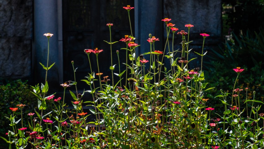
“Historically, flowers have been admired and used decoratively, adding their scents and beauty to our lives. But nineteenth-century women, especially those living in France and England, were caught up in a formalized culture of flowers, often painting elaborate floral scenes. Some claimed that the symbolic meanings given to flowers were an unstated universal language to be studied and used….
“Articles, pamphlets, and entire books on the symbolic language of flowers first appeared in Paris and other French cities around the end of the Napoleonic Wars (1803–15)…. The most important event that codified the language of flowers was the publication of a Parisian book in 1819 by Madame Charlotte de Latour, a pseudonym. Most scholars agree that the author’s real name was Louise Cortambert (1775–1853), the wife of geographer Eugène Cortambert. The Latour book, Le Langage des fleurs, listed flowers by their seasons, and meanings that single blooms or a mixed bouquet would convey between friends or lovers….
“Orange-colored flowers signified hope….“
According to Wikipedia, there are over thirty shades of orange — and these iris blooms I found in some filtered sunlight at Oakland Cemetery seem to show off many of them. The first gallery positions the irises in their natural surroundings; for the second gallery, I removed all the backgrounds — which gives the swatches of sunlight on each bloom an extra little glow.
Select any image in either gallery to see embiggened versions. You can then choose “View full size” to get a closer look at the color and detail.
From “The Onset of Spring” by Elizabeth Lawrence in The Writer in the Garden, edited by Jane Garmey:
“When the daffodils are waning and the tulips coloring, dogwood and pearl bush, flowering almond, snowflakes, and the early white iris are at their best, and trees and trellises are dripping with purple wisteria. Then spring is in full flower with tulips, lilacs, and flowering crab-apples, followed closely by peony, iris, and mock orange.”
“Color is one of the main signaling strategies flowers use to beckon their pollinators. Floral colors also serve as filters, selectively attracting specialist pollinators to certain blooms while eliminating others. For many of those pollinators, the brighter the better, which must be why floral colors, especially those created by the petals, are among the most highly saturated colors found in nature. Technically speaking, saturation is the strength of any given color in relationship to its own brightness. The purest, most highly saturated colors are of one or a few close wavelengths and contain almost no white light (the combination of all wavelengths), while unsaturated colors appear faded or washed-out because white light has diluted the colors. Saturated colors can be equated with their perceived intensity.”
Hello! Below are a few photos of white irises I found while iris-hunting at Oakland Cemetery a couple of weeks ago. Click here or page down to view the galleries.
As I’ve written here before, I use both Lightroom and the Nik Collection for developing my images. My general workflow includes culling RAW images in Lightroom to eliminate those I don’t plan to process, then working through Lightroom panels to adjust sharpness and noise, optimize exposure, remove spots, and improve overall color saturation and luminance. For black-background photos, I use Lightroom graduated filters, radial filters, or brushes to “erase” everything around the subject by reducing exposure, whites, and shadows to remove all the color.
Once I’m satisfied with the appearance of a photo in Lightroom, I edit the image in several Nik Collection tools, using Color Efex Pro to further enhance contrast, color, and detail. The Nik Collection tools don’t update RAW files directly, so on first launch they create a copy of the original RAW file (which is added back into Lightroom). I have a recipe (or preset) in Color Efex Pro for seven filters I use most often:
White Neutralizer, which brightens and removes any color cast from whites.
Brilliance/Warmth, which enhances individual colors and has a setting called “perceptual saturation” that adds a touch of depth to the image.
Tonal Contrast, which affects the color and contrast of image detail in such a way that I often use it to soften backgrounds and make them appear more out-of-focus than they were in the original RAW file.
Pro Contrast, which also enhances contrast, but in a way that increases the texture of key details in the image.
Darken/Lighten Center, to brighten areas I want to draw your eye to, and darken others (especially color-filled background elements).
Reflector Efex, which simulates the effect of directional light from a flash or reflector on selected parts of the image, that I usually use to brighten shadowed areas.
Levels & Curves, which provides tone-curve adjustments (similar to those in Lightroom) that I use specifically to remove excess cool-blue color cast that my camera tends to produce.
I seldom use all seven of these; it just depends on the image and what I decide I like while making adjustments with each filter. There is also some overlap between results you can achieve with the Nik Collection and those you can achieve with Lightroom; but the two tools use different techniques for enhancing photos, and (for my purposes) the Nik Collection targets colors in subtle and effective ways that can be very tedious to accomplish in Lightroom. For the photos in the galleries on this post (and for several dozen other iris photos I’ve updated with black backgrounds), I tried to render whites that were nice and crisp, and create color variations that contrasted well with other parts of the photo, and so that you’re eye would register fine lines and details in the shapes of the flowers.
Park all that for a moment.
When I finish post-processing and exporting the photos from Lightroom, I use an app called FileBrowser on my iPad to review every one. I got into that habit a couple of years ago, after discovering that I could find flaws in a photo that I still needed to correct, typically spots that I didn’t notice on my computer monitor or color variations that didn’t look quite right. These perception differences occur because mobile devices use different color spaces and screen resolutions than monitors do, and, of course, it’s easier to inspect an entire photo on a small screen held closer to your eyes than it is on a monitor. With black-backround photos, tiny areas around the edges of the subject or elsewhere in the frame that I missed while brushing in the darkness are much easier to see on the iPad, but I also noticed some artifacts appearing when I created pure black backgrounds that surprised me.
Here’s a screenshot from my iPad showing one of the photos from the galleries below. If you look at the bottom of the image and move your eye up, you’ll see that the black of the iPad screen and the black background of the image are different, and there are slightly off-black horizontal pixels running from the bottom toward the middle of the photo and, less obvious, a halo around the flower itself.
At first I thought it was just my eyes reacting to the contrast between the white flower and black background, or the iPad’s overall brightness, or the room lighting, or maybe a ghost in the machine. I had completed about fifty black-background photos of Oakland irises for this ongoing project, though, and found the off-black shading on all of them — with the intensity (especially of the halo effect around the flowers) varying quite a bit, but very evident on many of the photos. And, you know, some things you see you just can’t unsee … so I decided to try and figure out why this shading was occurring.
Here’s the RAW image in Lightroom after I completed exposure and color adjustments and darkened the background, with the exposure cranked way up so I could determine if the ghosting was occurring in Lightroom. As you can see, the background is pure black, showing no artifacts.
Here’s the same image, after passing it into the Nik Collection’s Color Efex Pro and returning it to Lightroom, also with exposure cranked up. Here you can see the artifacts clearly: the shift to light gray running from the bottom of the photo to the middle, and the concentric halos around the flower.
So now I knew that Color Efex Pro was creating the ghosting effect; but since I had applied as many as seven of the filters to each photo, I didn’t know which one was responsible. To figure that out, I started over with a couple of the photos, passing each one through Color Efex Pro, applying only one filter on each pass, then checking the results in Lightroom — and determined that the horizontal shading running from the bottom up was from the Reflector Efex filter, and the concentric halos came from White Neutralizer.
I interpret this — possibly inaccurately — to mean that these two filters are altering the red, blue, and green pixels (especially evident on the halos) to create their effects, gradually decreasing in intensity as they transition away from the targeted part of the photo. If the background wasn’t black — meaning, if it still contained colorful elements in shades of red, blue, and green — then the filters would simply alter the intensity of those colors and not show any sad effects. Having learned what causes this ghosting, I need to avoid using these two filters on my black-background images… which also means I need to re-process about 40 photos — argh! — so am headed back into my “darkroom”. See you in a couple of days! 🙂
Select the first image from each set to see larger versions; and try “View full size” if you would like to get a closer look at the color and detail.
Hello! Below are a few photos of black irises I found near the entrance to Oakland Cemetery while on my recent photo-trips. As you can see from the photos, even though it’s a called a “black iris” there are threads of purple, magenta, and dark blue running through all the petals. In brighter spots — as shown in the first two photos — yellow sunlight emphasizes the intensity of the purple and magenta shades; whereas those more shielded from the sun — where the light shifts to cooler colors — show blue highlights instead.
Select the first image to see a larger version; and try “View full size” if you would like to get a closer look at the color and detail.
Come on let us see all the real flowers of this sorrowful world.
After the dream how real this iris!
I’ve made enough progress with post-processing iris photos I took at Oakland Cemetery in April that I decided I would start posting some of them. Well, in this case, one of them. This beauty produced a huge blossom, about six inches across at its widest points; and if you stare at it long enough, you may feel like it’s in motion, the petals waving at you in a spring breeze. The colors — blends of dominant purple shaded with blue — are the most common iris colors, and this flower’s large size shows them off well.
Select the image to see a larger version; and try “View full size” if you would like to get a closer look at the color and detail.
Because many of the iris blooms were so large, I used narrow apertures (f/14 or higher) to get as much of the bloom (from front to back) in focus as possible. Doing so brings in a lot more background elements at the same time, of course, so as I’ve been working through the photos, I’ve made decisions about whether to keep the background as shot (which works well for an isolated bloom or a bloom and its leaves), blur it (which you will see in some future posts), or remove it entirely. The iris shapes and colors fare really well against total black, so I picked out about half of the 120 photos for background removal — despite how long it takes to “unmask” the twists and turns of the flower petals and get the final result right.
Below are side-by-side variations showing the original image of the iris, followed by the black-background version. I used Lightroom’s spot removal tool to repair some defects in the petals, though happily didn’t have to spend too much time deleting offending pollen bloblets from the flower. I also made exposure and color adjustments in Lightroom — and applied some contrast and detail filters in the Nik Collection — to lighten excess blue shades (partly a darkening or saturating effect from using narrower apertures) and add a bit of additional texture. To remove the background, I dragged a Graduated Filter across the entire image; set Exposure, Contrast, Highlights, Shadows, Whites, and Blacks as shown below; then used the Erase brush to reveal the bloom while leaving the background black.
Select the first image if you would like to compare the before and after renderings.
One down, 120 to go! Thanks for reading and taking a look! 🙂
“Before recorded history, all cultures collected, used, and admired flowers not only for utilitarian purposes, but for their elusive fragrances and ephemeral forms that, ironically, symbolized recurring vigor and even immortality. They have enthralled and seduced us, exploiting entire civilizations to enhance their sex lives and spread their seeds. We give and receive flowers as tributes, and to commemorate life’s many triumphs and everyday events. Flowers accompany us from cradle to grave. As spices, they flavor our foods and beverages. We harvest their delicate scents, combining them into extravagantly expensive mixtures, for perfuming our bodies to evoke passion and intrigue….
“Flowers inspired the first artists, writers, photographers, and scientists, just as they do today on street corners, in florist shops and farmers’ markets, in books, paintings, sculptures, and commercial advertising. They moved online with ease.”
“Spring comes, the birds sing in the trees once again, leaves return to the trees which lost them, flowers bloom in the high meadows and on the slopes, streams overflow with waters of melting snow. Through it all, the mountain continues to sit, unmoved by the weather, by what happens on the surface, by the world of appearances…. As we sit holding this image in our mind, we can embody the same unwavering stillness and rootedness in the face of everything that changes in our own lives over seconds, hours, and years.… “May we continue to give ourselves over to what is deepest and best in ourselves, over and over and over again, encouraging those seeds of our truest nature to grow and flower and — for the sake of all beings near and far, known and unknown — nourish our lives and work and world from moment to moment, and from day to day.”
Here we are, on the last day of the month … we made it through April, mostly hunkered down but with occasional outdoor excursions, observing the birds that still sang, the trees that waved to life in their varied shades of green, and of course the plants and flowers that unrolled Spring 2020 like a blanket of color, texture, and shape. What will May bring? More uncertainty, more unknowns, probably more confusion … and, for me, new collections of irises, wisteria, and spiderwort — from photos I’ve taken over the past few weeks — along with more photos of any other flashes of color that catch my eye.
For this last clematis collection, I altered variations of images from the previous two posts to remove the background — something that creates nice contrast with the purple, violet, and magenta colors prominent in these blooms. For the first gallery, I used Lightroom brushes to patiently paint the backgrounds black, following (in slow motion!) the outer lines created by each petal. For the second and third galleries (showing a Bernadine Clematis), I used radial filters instead of brushes, to create the impression of light fading from the center of the bloom to each petal’s edge.