“Until color film became reliable, many great photographers brought to light the beauty they saw in nature using black-and-white imagery. Some of them stayed with black and white their entire lives. While Ansel Adams used color in his early commercial work, he chose black and white to express the natural world that he loved. Black-and-white work has long been considered to be art photography.
“Working in black and white will actually strengthen your ability to compose pictures, and to see and use light. In the absence of color, we can see the shapes, lines, forms, and textures that light reveals in the landscape. Color can seduce us away from those things, if we let it. I maintain that you can work in both color and black and white and do well, if you are looking at the elements for their graphic representation and paying attention to tonal values. I still think in color, and I understand the language of color, after so many more years devoted to it…. But the digital darkroom has allowed me to explore black and white more easily again, and now, when I create a black-and-white image, it’s because the color isn’t doing it for me, while light and contrast are.”
Actually it wasn’t that stormy until a few minutes ago, but it has been unusually dark — dark gray winter dark — all day long, so despite my camera begging me to take it on an outing, I opted to stay in, keep it dry, and convert a few of my previously posted photos to black and white.
I probably don’t do these conversions often enough, especially since I do find the exercise interesting — more interesting than just pushing the “Black & White” button in Lightroom. The button-push creates a very literal interpretation of the image with the color replaced by gray tones that look pretty flat and lack contrast. The fun comes when you realize that in the color photos the white blossoms aren’t just white but contain blue, aqua, and sometimes yellow or orange; the stems contain green, red, yellow, orange, and a bit of purple; and the backgrounds (for those where I hadn’t already removed it) contain every color Lightroom lets you work with: red, orange, yellow, green, aqua, blue, purple, and magenta.
Playing with the “Black and White Mix” in Lightroom lets you adjust various color channels to bring in more contrast; in this case, I could brighten up the flower petals, dim the backgrounds and stems, and create little black dots or other shapes in the center of those blooms that had yellow or orange filaments in the color photos. After doing that with these photos, I then used Lightroom’s Color Grading to add a little silver/blue to the midtones, shadows, and highlights — which is just something I like (and previously described here, here, and here). For these photos — especially the camellia’s, the last two images — I added more softening than I usually do using Lightroom’s Texture and Clarity adjustments, because they seemed to work well on those big white petals.
As I was working on these, I started wondering if I would have composed any of the images differently if I intended them to be black-and-white images instead of color. I already know that I often compose with the idea of removing backgrounds in mind, so it would seem that I might do something different on a shoot if I was intentionally trying to produce grayscale images. Like many people, I suppose, I shoot in color because Lightroom lets you convert color to black-and-white, but not black-and-white to color. Theoretically, the camera captures more shadow and contrast variations by shooting in color then converting; but I’ve never tried it so I think it might be worth switching the camera to black-and-white mode to see what happens. Also, creatively speaking, sometimes it’s good to work within an artificial constraint like this just to learn from it.
Below are the black-and-white images, paperwhites followed by quince then two camellia blossoms. After that, I’ve included a single gallery showing the color and black-and-white versions for comparison.
“Named for French botanist Pierre Magnol (1638–1715), Magnolia is a famously old genus. It is also hard to define; current thinking suggests 200-plus species. Some botanists favour splitting it, others dumping the entire Magnoliaceae into it. The fossil record is rich, with family members dating back 98 million years, and Magnolia itself being of Cretaceous origin, i.e., contemporary with the dinosaurs but before bees: it is thought the first magnolias were pollinated by beetles.
“Magnolia flower buds are used for treating sinus problems in Chinese herbalism, and the bark… is prescribed for a wide range of conditions, although it does contains high levels of alkaloids and concerns have been raised over its safety. Flowers are used for flavouring, or at least ornamenting, certain Chinese teas, while buds are deep fried and eaten as a spring delicacy; they are somewhat tasteless, but the petals make an attractive addition to a salad….
“Wreaths of M. grandiflora foliage are traditional in the American South (they dry slowly and can be kept for months), and the flower, an emblem of the Confederate army in the U.S. Civil War, remains a potent symbol of the white American South…The 1989 film Steel Magnolias conjures up an image of something beautiful but also very tough; the tree symbolised the character of the women in the film….”
Despite making over sixty trips to Oakland Cemetery’s gardens over the past year, I hadn’t previously turned my camera toward any of the large magnolia trees growing on the property, some originally planted in the late 1800s and still thriving. They tower in height second only to the gigantic oak trees for which the property was originally named (see Early Landscapes: The Trees of Oakland), produce an enormous volume of blooms, and shed leaves as large as footballs that drop in a circle surrounding each tree’s trunk. The circles are as wide in diameter as the trees are tall, and as thick and bouncy as the beds of discarded pine needles you might find in any ancient forest.
Magnolia tree branches are some of the densest and most twisty-looking structures in the plant kingdom, I swear, making it a challenge to find a focal point for composing a photo. It’s also true that very few of their flowers are at a height I can get too without a ladder, which of course doesn’t fit in my photo bag. Nevertheless, with a zoom lens and the luck of finding a few branches hanging low to the ground (like the fourth photo below) I took a few dozen photos of the blooms that I could zoom in close enough to “fill the frame” — expecting I could figure out how to isolate the blooms from the entangled branches once I got at them in Lightroom.
Here are the first three, where I kept most of the leaves directly attached to the bloom stems in the frame, while blacking out all the rest.
Here’s one of the few flowers I found close enough to the ground (about five feet up) that I could get a shot that included the Internal structure of the flower, conveniently framed by an old and highly photogenic stone wall. If you’d like to get a closer look, click here.
Here are the last three, where I isolated just the flower — or, in the last photo, isolated the flower with a few of the leaves that (for reasons only the tree understands) were all reversed, showing the yellow-gold backs of the leaves instead of their dark green fronts.
Here are before-and-after versions of the seven photos, with most of the adjustments complete in both versions, but where I turned off the black background mask to show the blossoms in their original context: a mass of leaves and lots of blown-out highlights from sunlight filtering through the branches. It was a fun experiment to see if I could get results I wanted from the originals: creating the illusion that I’d taken macro photos of the magnolia blooms when, in reality, I used a zoom lens and stood about twenty feet from the trees to get these photos. It was also a lot of work — about two days of brushing black over the backgrounds and fine-tuning the mask — but I’m glad I gave it a shot.
Select any image in the gallery if you would like to compare the before and after versions in a slideshow.
With so many easily applied computerized shortcuts to aesthetic appeal at our disposal, many people have come to associate their use with obvious, often egregious, visual effects and gimmickry.
I take no issue with any method of creating images, so long as the artist’s purpose is fulfilled. To me, an image should encapsulate a state of mind and a deeper meaning than just aesthetic appeal, and I use whatever tools I need in order to convey the moods, sensations, or ‘stories’ that I am after….
[I] wish to reflect something of the experience of creation, discovery, and romance I felt at the time of making the image. It therefore seems obvious to me that my images should look natural, regardless of any tool used or creative license I allow myself. I create images in order to satisfy my desire for significant experiences and with the purpose of sharing such experiences with others who may be similarly inspired by them….
Various methods and tools sometimes lumped under the term ‘manipulation’ can be effective in overcoming limitations imposed by the capabilities of cameras and lenses, or by undesirable qualities of subject and light, and that may obscure what an image is about — what the artist sought to express and the impression they wished to impart….
What’s real about an expressive image is never its objectivity, but how it is subjectively perceived.
I often like to include quotes on some of my blog posts like those above from Guy Tal’s More Than a Rock. Tal’s essays move effortlessly from ideas about a photographer’s vision to writings on creating images and how to do it better, and — most importantly — how to think about it better. His is among many photography and creativity books that I often turn to for sustenance and grounding — in this case after stumbling into an internet trash heap where people were throwing rubber chickens at each other whilst debating their preferences for “un-manipulated” images. This is a recurring argument on photography web sites that never ends well … or just never ends. I didn’t participate, but I read too much and it made my brain hurt, so I needed to dive into a good book.
My quote selections are seldom entirely random: they often relate (at least around the edges) to a post I’m writing, though sometimes their equally spurred by things I haven’t written … posts still in my head, you might say; or the stream-of-consciousness of a madman, you should not say. Books, for me, always have been and always will be a refuge from the barely-hinged ramblings on the web, and More Than a Rock is no exception. Highly recommended, his book is, if the subjects he covers interest you.
With every series of photographs I take, I end out with a handful that I set aside because I’m not sure if I’ll be able to convert them into satisfying images. From my Exploring Architectural Photography: Steel and Stained Glass blog posts (see 1, 2, and 3), there were four like that, and since I learned a few new things while transforming them, I thought I would share what I learned. Here are the four almost-rejected photos:
I took the first photo (top left) while standing outside a mausoleum door, with my wide-angle/zoom lens set to 18mm, its widest zoom level. My goal was to frame the stained-glass window within the door openings, but standing a few feet from it created perspective distortion (which was not as apparent in the camera’s viewfinder) that I wasn’t aware of until I loaded the photo in Lightroom. The second photo (top right) was taken on a sunny day, in a partially shaded area, causing heavy shadows on the window while blowing out highlights on the concrete blocks — which, as you can see from the mortar lines in the photo, are not actually straight. The third photo (bottom left), taken on the same day, shows excessive lighting on the columns and walls to the right of the window, with too much shadow on the window itself. The fourth one (bottom right) was another attempt at capturing the light and color of a window while using the door as its frame. Since I didn’t stand as close as I did in the first photo, there is less distortion to the lines formed by the door, but heavy shadowing caused by exposure settings needed to capture the window without over-exposing it.
For the first photo, I wanted to see if I could square the door and its openings. Lightroom provides two tools to help correct perspective problems like this, the Lens Correction and Transform tools, shown below.
I’ve been using both of these tools on my recent photos from Oakland Cemetery as an opportunity to get some practice working with architecture images and get more familiar with the kinds of adjustments I might need to make to photos of buildings. The first of the two tools — Lens Correction — adjusts for the bowing effect often created by wide angle lenses, especially at the edges and at wider zoom levels (like the 18mm I used for this photo). In addition to correcting wide-angle distortion, Lens Correction also adjusts excess shadows (vignetting) at the edges, and both distortion and vignetting can be modified further by the two sliders just below the Profile dropdown. As you can see from the screenshot, Lightroom identified the specific lens I used, selecting it automatically when I clicked the Enable Profile Corrections checkbox. Adobe maintains a long list of lenses with supported profiles; but in the rare case that you are using a lens with no Lightroom profile, you can select “Manual” (just below “Lens Correction”) and adjust distortion and vignetting yourself.
I’ve seen recommendations in Lightroom tutorials and books that Lens Correction should be used on every image, a recommendation that I can see clearly makes sense for images with a prevalence of straight lines or angles. The impact on a photo varies a lot by lens, zoom factor, and camera position, so I normally don’t use it for closeup or nature photography unless there’s some element of the image that to my eye contains an obvious distortion. Apart from vignetting, distortion correction appears to “flatten” the edges of the images — which I think is why Adobe recommends using Lens Correction before using Transform. With some of the photos in my architecture series, minor variations in straight lines — especially as they transition from the center to the edge of a photo — were often rendered straight enough by Lens Correction alone.
With this photo, however, the distortion was pretty extreme so I did use Transform to straighten it further. The Level and Vertical buttons on the Transform panel correct horizontal and vertical distortions; both work well and Vertical works especially well to adjust for hunchback photographers like myself ( !! 🙂 !! ) who often don’t realize they’ve leaned forward or backward when taking the shot. Auto and Full are similar, though Auto creates more subtle combinations of horizontal and vertical adjustments than Full — which sometimes makes pretty extreme corrections that will require further cropping but will be technically as straight as can be. Guided Transform is fun to play with, and there is a short, precise video here where you can see it in action: Guided Upright in Lightroom. Go take some crooked pictures and give it a try!
Here are the before and after versions side-by-side. Other adjustments included my usual spot-removal/color blending magic to smooth out some of the scratches and dents on the steel door; color and luminance adjustments to brighten the window and render it as the focal point; and a bit of shadow adjustment to bring out some of the detail in the wall on the right side — which exposed some converging lines to draw your eye back to the window if your eyeballs drifted toward something else.
Select the first image to compare the two in a slideshow.
For the second photo at the top, I wanted to correct three problems: the lines between stones weren’t parallel; the stained glass window behind its rusted steel grate was barely visible in the original; and the stone was awash in shaded but bright light and lacked most of its real-life detail. As with the previous photo, I used Lens Correction and Transform to straighten the lines, then made basic exposure and color adjustments to brighten and saturate the stained glass and the steel grate. It would have been great to remove the grate, but I’d left my powertools at home and trying to spot-remove it away in Lightroom required too much patience even for me.
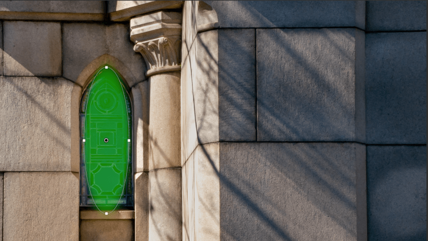
To get a look I wanted for the concrete wall, I added a radial filter over the window and inverted it (indicated by the green shading), as I’ve previously described in Before and After: Yellow and Green (and Lightroom Radial Filters. I then adjusted highlights (to counter the effect of bright light), blacks, shadows, and texture to create detail and grain in the stone, along with using the Dehaze slider — my go-to tool for adjusting contrast as I like how it treats color, even though that’s probably not its intended purpose.
Here are the before and after versions of the second photo. If you view them one after the other in a slideshow, you will see how Lightroom made just the right corrections to the horizontal lines to the right of the window, while keeping those to the left of the window intact (since they didn’t really need to be adjusted).
This third image suffered in two ways: the window, in the original, was fully shaded because it was set inside the concrete wall, and the sun was coming at the building in all its bright glory from the east (or left of the image). While the window was shadowed, the column and the wall were too bright, with overblown highlights and lost detail. I first made some exposure adjustments: reducing highlights as far as Lightroom would let me on the Basic panel, and lightening shadows to start recovering detail in the window. The column and wall were still too bright, however, so here I am using a graduated filter to reduce the highlights and whites even further on the right part of the wall only.
These changes improved the appearance of the column and wall — IMHO — while retaining the angled shadow lines from a tree nearby. The window was almost how I wanted it to look, but I added a radial filter over the window only to improve its presence by upping exposure, softening shadows, increasing whites, and lightening blacks. I also added a bit of sharpening to show more of the window’s detail, after first reducing highlights (which helps prevent fraying at the edges of detail emphasized by the Sharpness, Texture, or Clarity sliders).
Before and after for the third photo below. Note, especially, the color shift and detail enhancements these adjustments created, while still preserving the sense that this photo was taken under late morning sunlight on a cloudless day.
Of the four images I’ve discussed here, this last one required the least effort to transform. My changes consisted of color saturation and brightness adjustments — mostly to jazz up the stained glass — along with some spot removal to eliminate dirt, flaws, and a crack in one of the glass panels. I had originally intended to keep the door frame nearly black, as in the before version, then decided it was nice to expose the design of the door, especially on the left and right sides. Shadow adjustments alone brought out the door detail, with a bit of a color shift to emphasize the aged steel or antique bronze look so common to many of the doors on the cemetery’s property.
Select the first image to compare these last two.
Finally, here are all the photos of stained glass and steel that I recently posted — all of which underwent similar transformations — in a single gallery.